Why White Space Gives a Page Its Pace
White space on a page can make dense material easier to use. Learn how to adjust margins and open areas for print, screens, and real content.
How much white space should a page have? White space on a page should fit the material and the conditions in which someone reads it. A museum label viewed at arm’s length, a printed schedule, and a phone screen each place different demands on margins and open areas.
White space is any visually quiet area around text, images, or other content; it does not have to be white. A paper margin, a pale background, or a calm patch in a photograph can give content room to register. Instead of asking whether a page looks spacious, ask whether its open areas help the content work in its actual setting.
White space on a page starts with its setting
Identify the page’s physical or digital setting before adjusting its margins. A page meant to be held close can use a different text area from a sign read across a room. Printing, cropping, screen width, and the amount of text all affect how open areas feel.
Check these conditions before editing:
- Print edge: If important text sits near the paper edge, check the printer’s printable area; if it risks clipping, move the text inward.
- Binding or mounting: If a bound booklet or mounted sheet hides part of an inner edge, check that area against the finished format; if content would disappear, widen that margin.
- Reading distance: If the page will be read from farther away, check whether the type and surrounding open areas make the message easy to locate; if the main information feels lost, simplify the composition and make the text more prominent.
- Content length: If headings or labels wrap onto extra lines, check whether the surrounding space still fits; if a heading is stranded or the page becomes crowded, revise the wording or layout.
- Screen width: If columns collapse on a narrow screen, check whether text and images still fit their available space; if they feel squeezed, stack them or reduce the number of columns.
- Background detail: If a photograph or pattern sits behind text, check whether that area is visually quiet; if the words are hard to read, move them to a calmer area or add a plain backing.
Each decision follows from what the finished page must accommodate, not from a universal margin formula.
Let the material set the page margins
Margins frame the text area and give the page room to breathe. A very broad margin can suit a short, reflective piece, but it can waste space on a compact schedule. A narrow margin can fit a reference sheet, yet make long reading feel crowded.
For text-heavy pages, consider line length alongside the margin. A wide column can force the eye to travel farther between lines; a narrow one can break phrases too often. Adjust the column and margin together, then inspect the page with the actual copy rather than placeholder text.
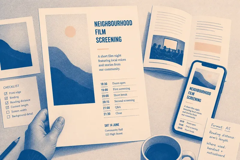
Say you are preparing a one-page program for a neighborhood film screening. The starting material is a long title, a short description, and a list of screening times. Put the title and description into the intended column, then check whether the times still fit without colliding with the paper edge; if the list is cramped, shorten the description or give the schedule its own area. The resulting layout makes a clear tradeoff between keeping all information on one page and preserving comfortable room around the schedule.
Separate content with page breaks, not decoration
Open space can divide sections without requiring a line or box. Use a larger blank area when the subject changes, and preserve enough room around images or diagrams to keep them from feeling pressed against neighboring material. Keep this decision focused on the physical separation between page regions rather than adding visual signals everywhere.
Inspect the composition at actual size. A gap that looks generous on a large monitor may shrink in print, while a broad band of empty paper can dominate a small handout. If space feels awkward, first check whether the content itself can be edited or repositioned before adding borders or decorative shapes.
On a screen, check the layout where it changes shape. A desktop spread may become a single column on a phone, and a long heading may wrap into an open area that once seemed ample. Use the real text at both widths; if a section becomes difficult to use, alter its arrangement rather than preserving the desktop version at all costs.
How can you judge whether page space is working?
Should printed pages have wide margins?
Not necessarily. Choose margins that suit the paper, binding, text, and reading distance; if a page will be bound or trimmed, account for the portion that may be obscured or removed.
Does white space need to be blank?
No. A quiet color field or a low-detail part of an image can create open space around content. If the background competes with the text, choose a calmer area or separate the text from it.
How should white space change on a phone?
Check the page at a narrow width with its real headings and images. If columns become cramped or content wraps into an awkward shape, stack the material and adjust the spacing for the new arrangement.
What should you adjust when a page feels crowded?
Check whether the copy, column width, image size, or margins cause the crowding. If the page contains more material than its format can hold comfortably, edit or reorganize content rather than shrinking every gap.
Review the page in its finished format
Print a draft or preview the page at its intended screen width, then check the edges, text column, image areas, and any changes in format. If the page is used in a particular place, inspect it there: a handout on a table and a notice on a wall are not read under the same conditions.
White space on a page is doing useful work when the content fits its setting without crowding the edges or leaving awkward, unusable voids. Keep a note of the actual format and viewing conditions as you revise; that simple record helps you make the next spacing decision for the page in front of you, rather than copying a layout that served a different purpose.